Yandex is the largest IT company in Russia. 20 thousand employees. Annual revenue is $3.5 billion. I created and headed the design department of advertising products that bring more than a half of the company's revenue. I was responsible for the way advertising looks, for the UI/UX of interfaces and for communication design.
Major achievements
- Created the common design department of advertising and analytics products. Growth from 7 to 35 designers.
- Built the new business-centric design culture across UX/UI and communication designers focusing on collaborative and innovative approach.
- Created and implemented the brand new company-wide design system.
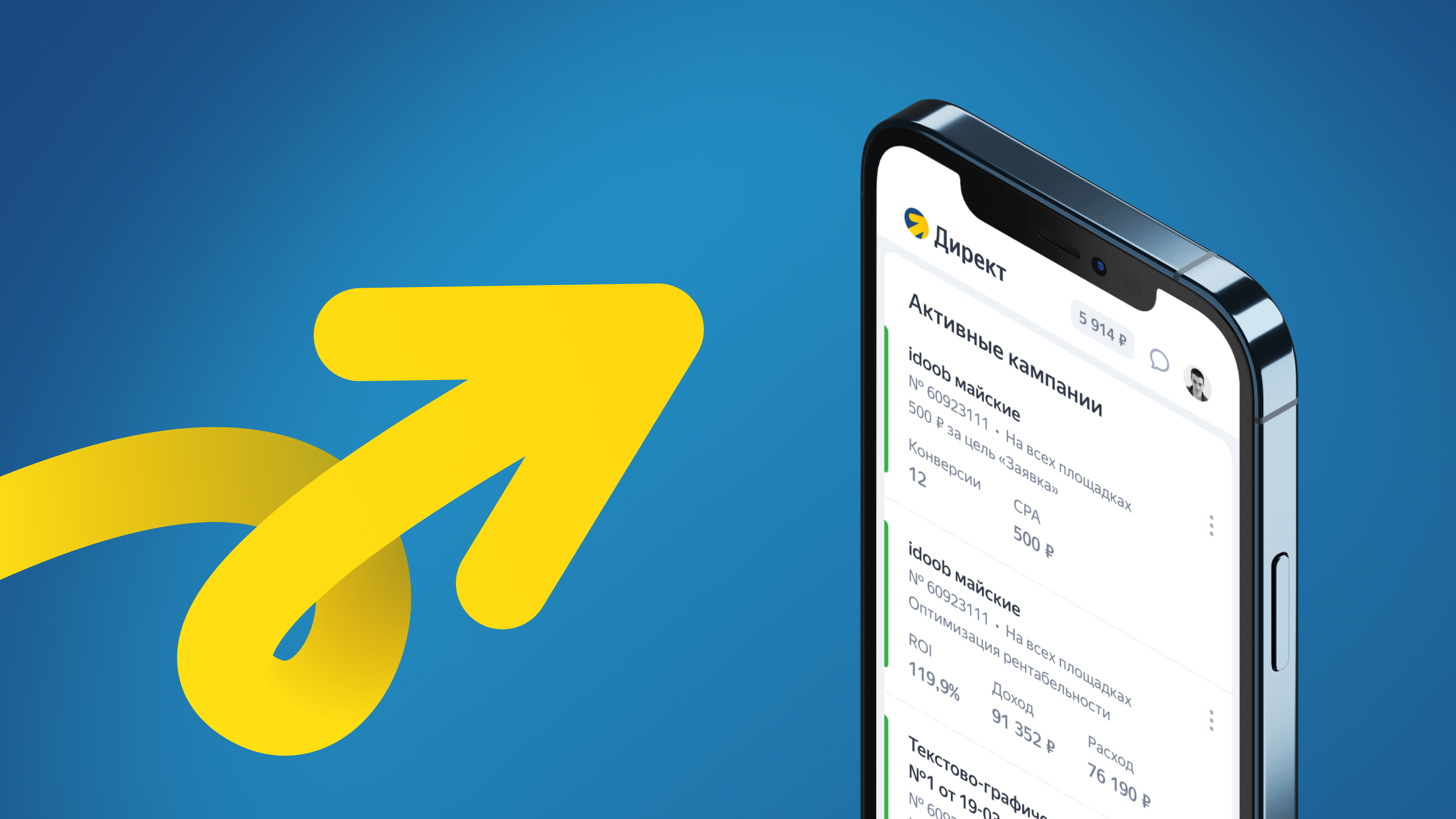
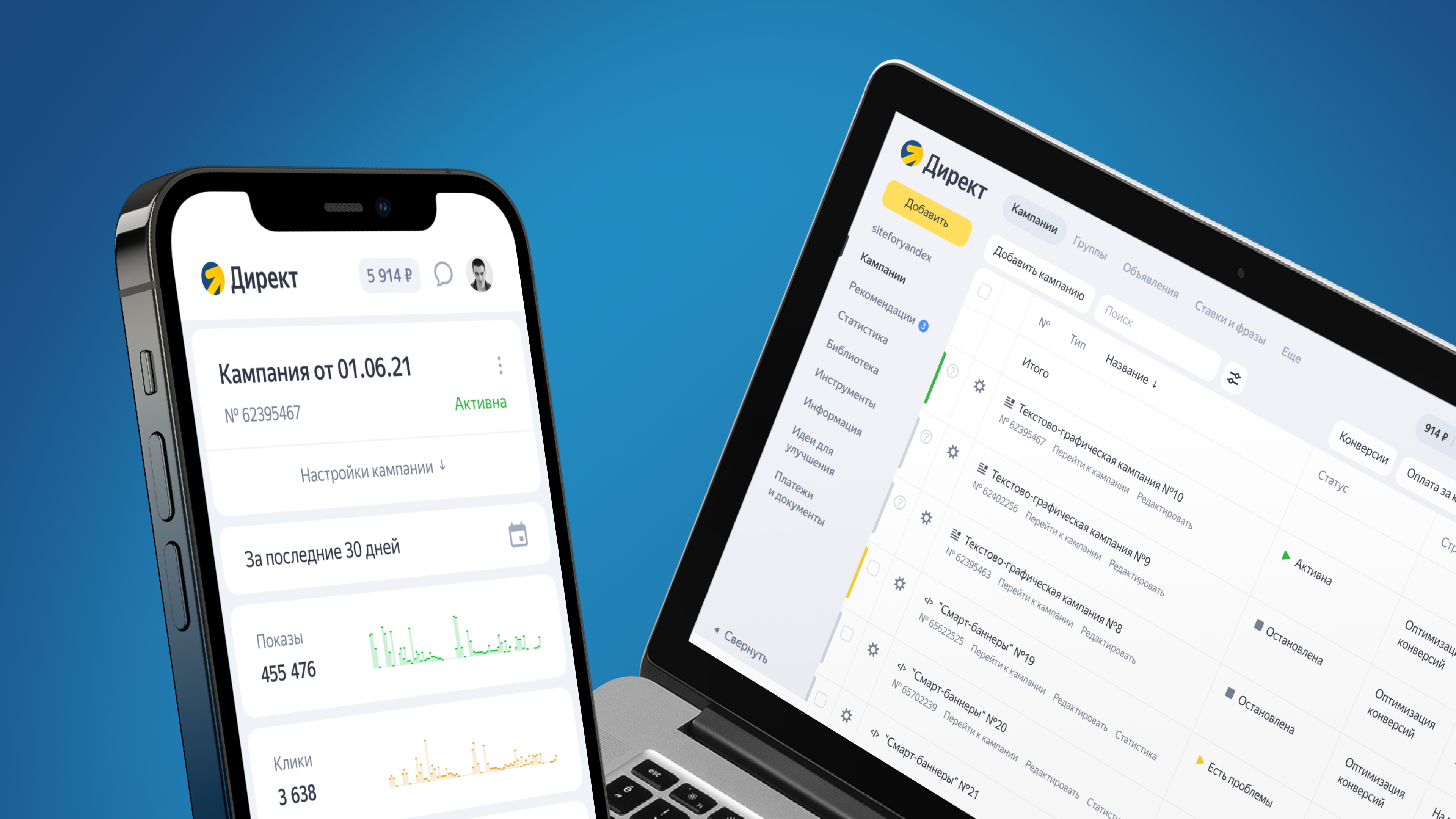
- Fully redesigned the main advertising product — Yandex Direct.
- Created a new brand — Yandex Ads.
Responsibilities
- Definition and communication of design strategy in company.
- Art-direction, creating design concepts.
- Managing design teams (product, marketing).
- Work with business stakeholders.

Yandex Direct is the main part of Yandex Ads
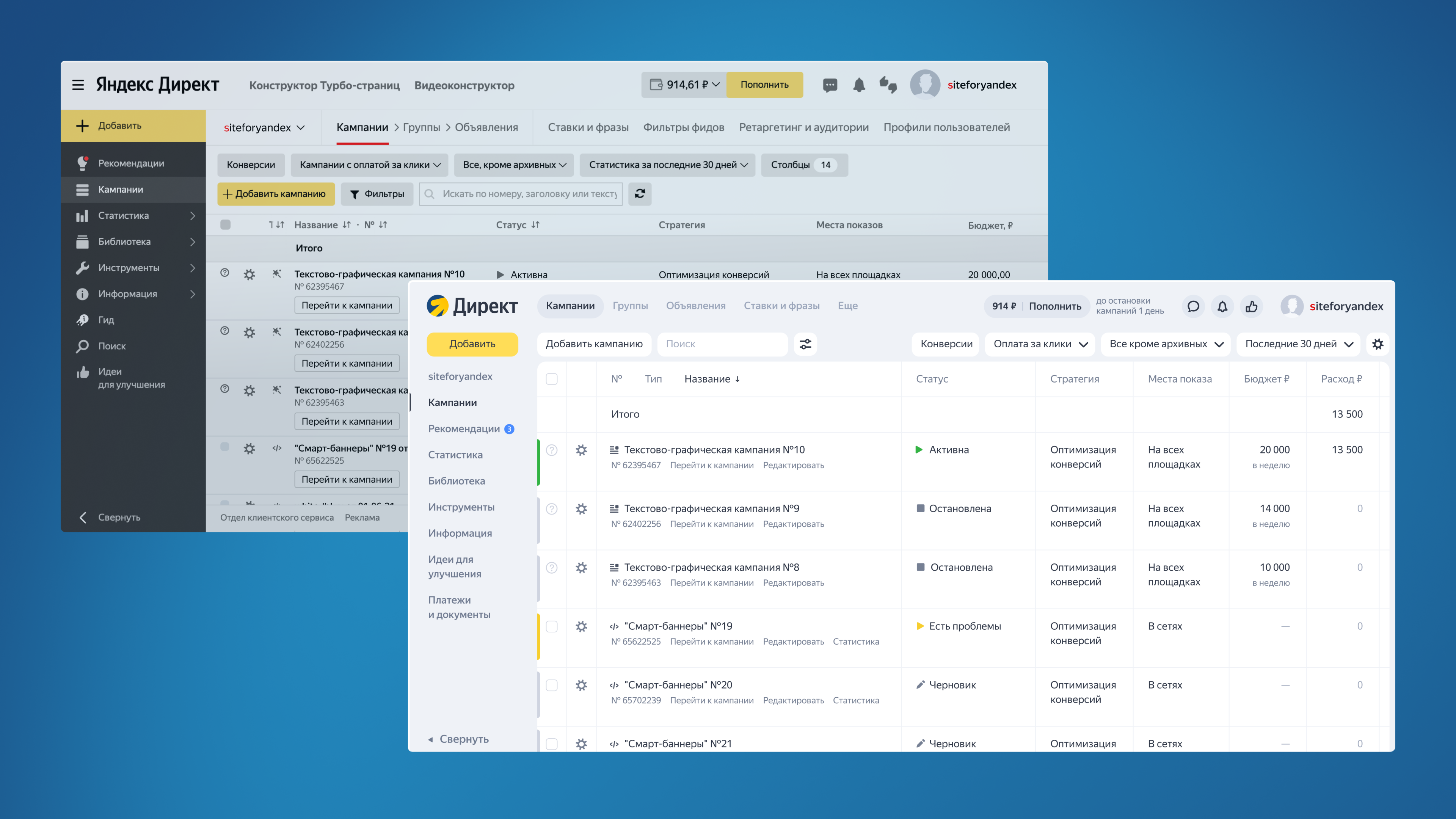
From the very start, Yandex Direct has been developing as a tool for specialists in digital advertising. It has always been a professional tool that is primarily valued for its functionality. Yandex Direct was an “advertising machine” and its user couldn’t stop working because he’d been on staff. Before using the “machine”, it was necessary to undergo serious training.
Step by step, there are more representatives of small and medium-sized businesses among our users who do advertising on their own. In other words, b2b clients have appeared in the b2b product, who stumble over unclear interfaces, leave or make mistakes when advertising.
We realized that we had to update our approach to design. Instead of upgrading the machine, you need to focus on the customer satisfaction, make the interface more convenient and clear, and the logic — more transparent.
Product Changes
Product redesign is a risky process. Users get used to the layout of elements and scenarios. Changes in the usual order can cause outrage, as people need time to retrain.
We did the following. First, we drew the concept of an ideal Yandex Direct — the way we want it to be. It is well organized and elaborated in term of all possible scenarios. After that, we tested it on our colleagues, showed it to marketers and some users. And we began to design an implementation plan.
In many companies, managers not only coordinate the final design, but also influence the design process itself: they offer solutions, ask to make several options, "toy with fonts". This can be understood — but it doesn't help.
If you give the designer more power, his responsibility will increase and the layouts quality will improve. Power makes the designer to be more involved, to monitor the metrics of the product and the business as a whole. From a "draftsman" he becomes a product owner.
We have separated the work of managers and designers:
- The manager finds an issue in the product (or a potential improvement). He checks if the issue really exists. He estimates how much it costs to be fixed, and whether it is profitable (in money or other indicators) to eleminate such an issue. As a result, the manager comes to the designer with an issue, and not with the intended solution.
- The designer studies the issue, looks for and offers solutions. Together with the manager, he works out solutions and tests hypotheses. He communicates closely with the development department and consults on solutions.
- The manager communicate the solution to the production, and is responsible for the launch.
We decided to use the current interface and implement styles from the concept directly on the layout: background, spacers, buttons, typography. At the same time, we do not change anything at all in terms of functionality, do not move elements and do not write a new text. So we wanted to understand whether the new styles (separately from the logic of work) affect user behavior or not.
After we showed the changes for a part of the audience, we saw that the new styles did not affect the main metrics in any way — we were happy, and showed it everyone. Then we took on UX and working out the details.
I advise avoiding “collective design”.
Collective design is a situation where different people in one team look at drafts (or iterations) and give advice.
The designer (and any performer) must 100% understand why a particular design decision was made. Don’t change the layout just because someone asked. We need to figure out what this change will give, and not just do it because someone thought it would be better.
In Yandex.Direct, the designer is the only one person who is responsible for all design decisions. Thus, he can’t just take someone’s advice without thoroughly understanding its benefits.
Identity Changes
Initially, we only needed a new corporate identity. Our marketing and product communications looked like isolated elements — each time they were somehow done. There was no guide and no understanding of what style should be. It was a practical challenge that would help us make our communications better.
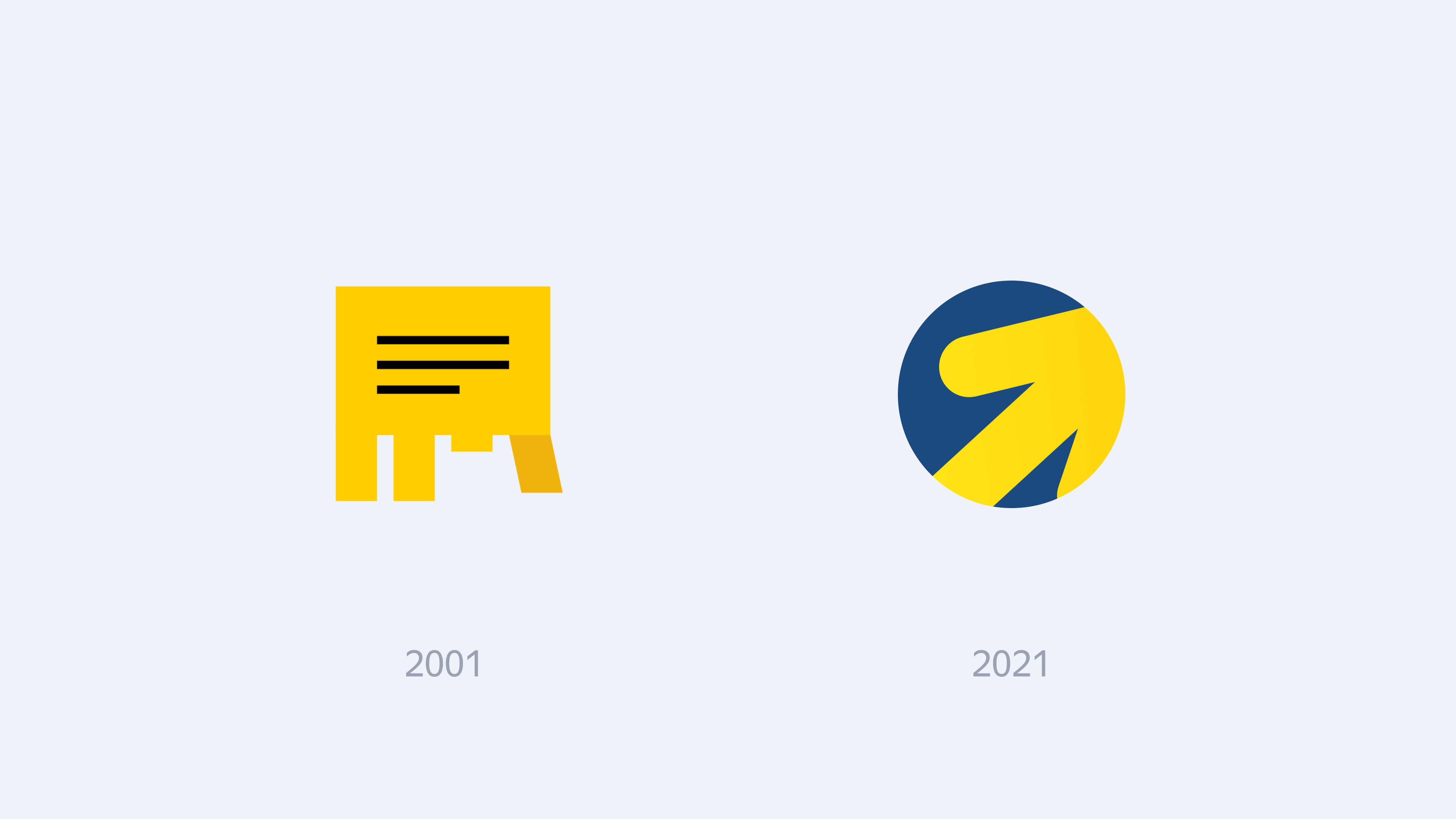
Along with the corporate identity, we decided to update the logo. Although the logo change is more about idea than practise. But our old logo depicted a paper ad. We needed a new one: modern, technological and having something related to advertising in the metaphor. The first attempts were done by different studios and agencies. The guys brought good versions, but they were either too technological, too abstract, or did not go well with the big Yandex brand. All of them could be logos of any modern product.
As a result, we decided to create a new logo “inside” in iterative mode. We treat agencies well and work with them a lot, but this time we took a shot at doing everything on our own.
When you work with external agencies, it looks like this: you fill out a brief, discuss it with the agency, answer questions. After that, they take it and return with almost final concepts. And if these concepts aren’t really appropriate for you, you need to do more and more approaches.
Inside, we started acting like researchers. We chose several directions and began to draw options. We met weekly and discussed which concept seems to be going to a dead end, and which one is promising.
This approach works only with very good designers who not only know how to work with graphics, but most importantly they can evaluate the current result, understand which of the options is good and which is not.
At some point we realized that the arrow should be the logo. It has the right metaphors: the cursor, the arrow from the “go” button, and the positive movement of the graph. This logo reflects the basic tasks of the service and is equal to its name, it symbolizes simplicity, growth and development. In addition, the arrow is simple, and the simpler the logo, the stronger it is. The only thing is that only popular products can use simple logos. If you are a small company, you have little chance “to stake out a simple logo”.
Then we worked on the shape and color. We made different options, discussed them in the design circle, and tested the formed shortlist on people: we showed different options to focus groups in order to identify and eliminate unnecessary associations.
How That Turned Out
As a result, we have updated not only the visual component of the product (identity, interface appearance, marketing communications), but also the functionality. We have made users closer to the service. It is important for us that businesses of any size and marketers with any level of training can easily solve their tasks in Yandex Direct.